We were commissioned by the National Trust to create a new visual language for the Lake District - home of Beatrix Potter, dramatic landscapes and fascinating histories.
Europe's largest conservation charity approached Wonder Associates to re-position and re-package a very special place - the Lake District. This is the National Park where the National Trust look after 125 mountains, 24 lakes, 59 listed buildings, 14 holiday cottages, 3 campsites and 90 tenanted farms. Welcoming 19 million visitors throughout the year, we developed and executed a creative based on the concept of four seasons, one Lake District.


The work
It all began with a studio trip through snowcapped fells, paths and lake shores. We joined the team of rangers for complete and utter immersion in the place. This research fuelled a plethora of great ideas back at the studio. The most compelling was selected to roll out across the Lake District with over 200 staff and volunteers and 19 million visitors.
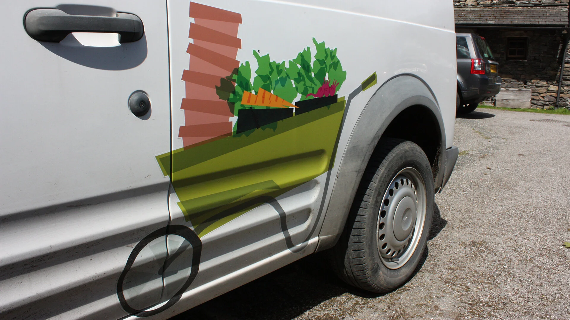
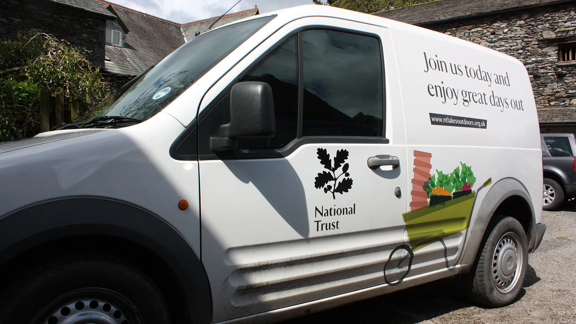
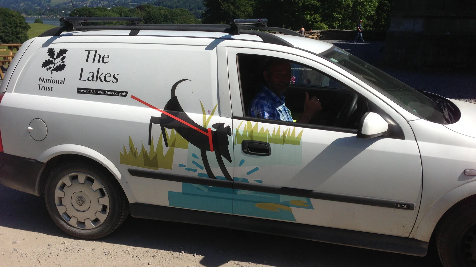
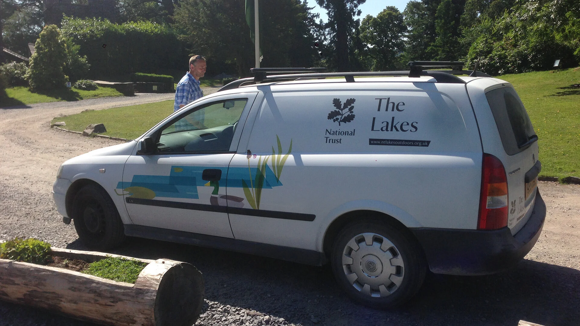
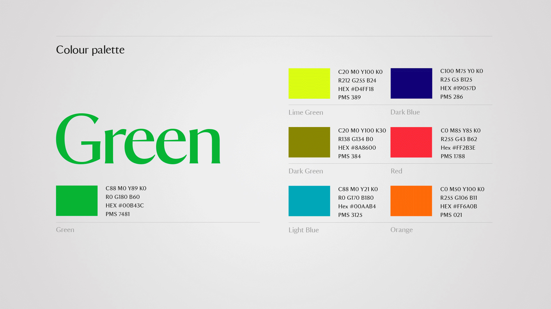
Using photography and bespoke illustration, we created a differentiating visual identity. We created clear, simple guidelines, a handy toolkit and templates for everyone to use. The roll-out we produced included signage and wayfinding, vehicle livery, interior graphics and POS, website user interface, small format print and merchandise.